Countertop Cameo: Building a Spinning Recipe Card Holder for a Holiday Food Campaign
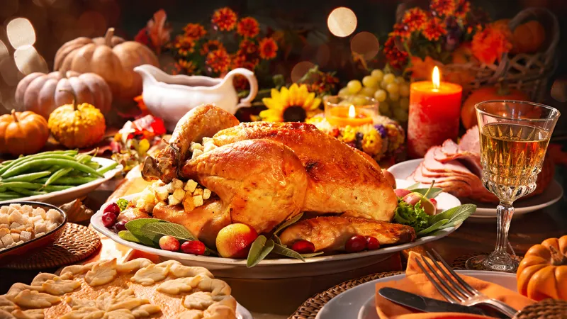
Photo: Thanksgiving recipe card holder on kitchen counter warm light linen napkin, via cdn.abcotvs.com
Thanksgiving food campaigns love a countertop that feels lived-in: a linen napkin with a crease that did not come from a box, a butter dish with a thumbprint, a recipe card leaning at just the right angle. The recipe holder is the quiet hero. It gives the art director a place to park the card, adds a little vertical interest, and can spin slowly in a loop without looking like a catalog product shot. Here is a fast, repeatable way to model and rig one for a food-brand client render or a portfolio piece.
Start with the counter, not the stand
Before you touch the holder, block the scene at real domestic scale. A standard US kitchen counter is about 24 inches deep, and the camera will usually sit close enough that a 4-by-6-inch recipe card fills a third of the frame. Model the holder around that card, not the other way around. A base roughly 4.5 inches wide and an upright about 6 inches tall gives you enough weight to look stable without turning the prop into furniture.
Drop in a few scale cues: a pie plate, a ceramic crock of utensils, a folded dish towel, a butter dish with a lid. These are not decoration. They tell you whether the holder reads as a countertop object or a tabletop monument. Keep the surrounding props low-poly at first. You are checking silhouettes and spacing, not baking a hero pie.
Build the holder like a prop, not a hero asset
A recipe holder is mostly negative space: a slot, a lip, a back plate, and a base. Resist the urge to model every screw. Use chamfers and weighted normals to catch warm highlights, then let the texture do the storytelling. Wood grain should run along the upright, not across it. Ceramic should have a slightly uneven glaze break at the edges. If the client wants a branded version, keep the logo area as a separate material so you can swap artwork without rebuilding the mesh.
The card itself deserves its own object. Give it a slight curve, a soft corner, and a tiny lift at one edge where it leaves the slot. A perfectly flat card looks like a UI element. A card with a whisper of warp looks like something a home cook actually propped up while basting a bird.
Cloth that reads as linen, not latex
The cloth is where small domestic props go wrong. A full cloth sim can eat an afternoon and still produce folds that look like melted wax. For this kind of shot, sculpt the big folds first and sim only the last few inches where the napkin meets the counter. Linen has low-frequency creases, a dry surface, and a little fray at the hem. It does not drape like satin, and it should not look wet.
Build the weave into the normal map, not the silhouette. Keep the folds away from the card slot so the holder stays readable. If you are rendering a turntable, check the cloth from the back side too. The camera may only see the front for three seconds, but the client will scrub the whole loop.
Glass, butter, and the fingerprints that sell it
Thanksgiving kitchens are full of glass: butter dishes, pie plates, measuring cups, canning jars. Glass in a warm interior needs roughness variation more than perfect transparency. Add subtle smudges around the lid and a few tiny scratches on the base. The goal is not dirt. It is evidence of use.
For the recipe card, use a paper shader with fiber and a soft deckled edge. Avoid pure white. A warm off-white with a faint butter stain near one corner will sit better against a linen napkin and a wood holder. If the card has handwritten text, keep it loose and slightly uneven. Clean vector type on a holiday card reads like a grocery list from a design template.
Warm light without the blowout
Warm interior light is the mood, but it is also the fastest way to clip highlights on glass and glaze. Start with a window source at camera left, a tungsten pendant overhead, and a large bounce card behind the camera. Keep the pendant at 2700 to 3000K and let the window run slightly cooler so the scene has separation. Use a soft area light for the card face, but keep it low enough that the paper texture survives.
Render passes separately if you can. A little bloom on the glass is fine; a blown-out butter dish is not. Check the specular rolloff on the holder's bevels. That is where a cheap-looking prop reveals itself.
Rigging the spin
Put an empty at the center of the base, parent the holder and card to it, and keep the surrounding props on a separate static group. A full 360-degree turn over eight seconds at 24 fps is usually enough for a social loop. Add a gentle ease at the start and end, but do not ease so much that the middle feels sluggish. The card should stay readable through the front arc.
Use a 50mm lens at f/2.8 if you want the background pie to fall away softly. If the client needs the recipe text legible, stop down and cheat the card forward. For the turntable, lock the camera and move only the empty. That keeps the light rig and reflections stable, which matters when glass is in frame.
A quick review checklist before handoff
Before you send the render, check the boring stuff: card scale against the holder, cloth intersecting the base, glass reflections repeating in a weird pattern, warm highlights clipping, and the spin speed feeling like a display rather than a race. Deliver a still, a short MP4, and a version with the card artwork on a separate layer. The client will ask for a text change. They always do.
A recipe holder is not the star of a Thanksgiving food campaign. It is the thing that makes the star feel placed. Build it at real scale, rig it simply, and let the linen, glass, and warm kitchen light do the heavy lifting.